First Draft

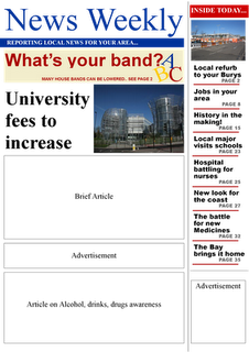
When coming to create the final piece we kept with the same headlines and title styles. We also kept with the same style/theme throughout the Newspapers. On the right hand side of the paper, we add an few headlights which would link to the rest of the page inside of the paper, making the paper look more realise. We had to move around some of the stories to allow them to fit on the pages correctly with their columns, making them similar to to original newspapers. Through are research we got a change to see how many adverts and articles an original front cover and second page would include, which lead us to use 5 articles, which was luck for us fitted great in the space we planned on the layouts. Within the articles we decided to only use an few picture within the newspaper, as that the pictures didn't take our the articles themselves. We only added images to the main stories, grabbing the reader attentions. With the colour scheme we keep it simple and only added colours of blues and reds to capture an characteristics, also our advert linked within the colour scheme would made them go well with the rest of the newspaper. When placing our articles into the layout, we had to re size many of the boxes and move them around to fit all the stories in. We decided to add images to the main stories, as having images for all the stories could of made the pages to full with images and take the attention away from the newspaper and the news.
Progression throughout making the newspaper:
Final piece:

Progression throughout making the newspaper:
Final piece:


No comments:
Post a Comment